
Branding4 min read10 chapters
What colour psychology can do for your website
Choosing the right colours for your web design is not as straightforward as it seems.

Digital Designer
Colour psychology in web design
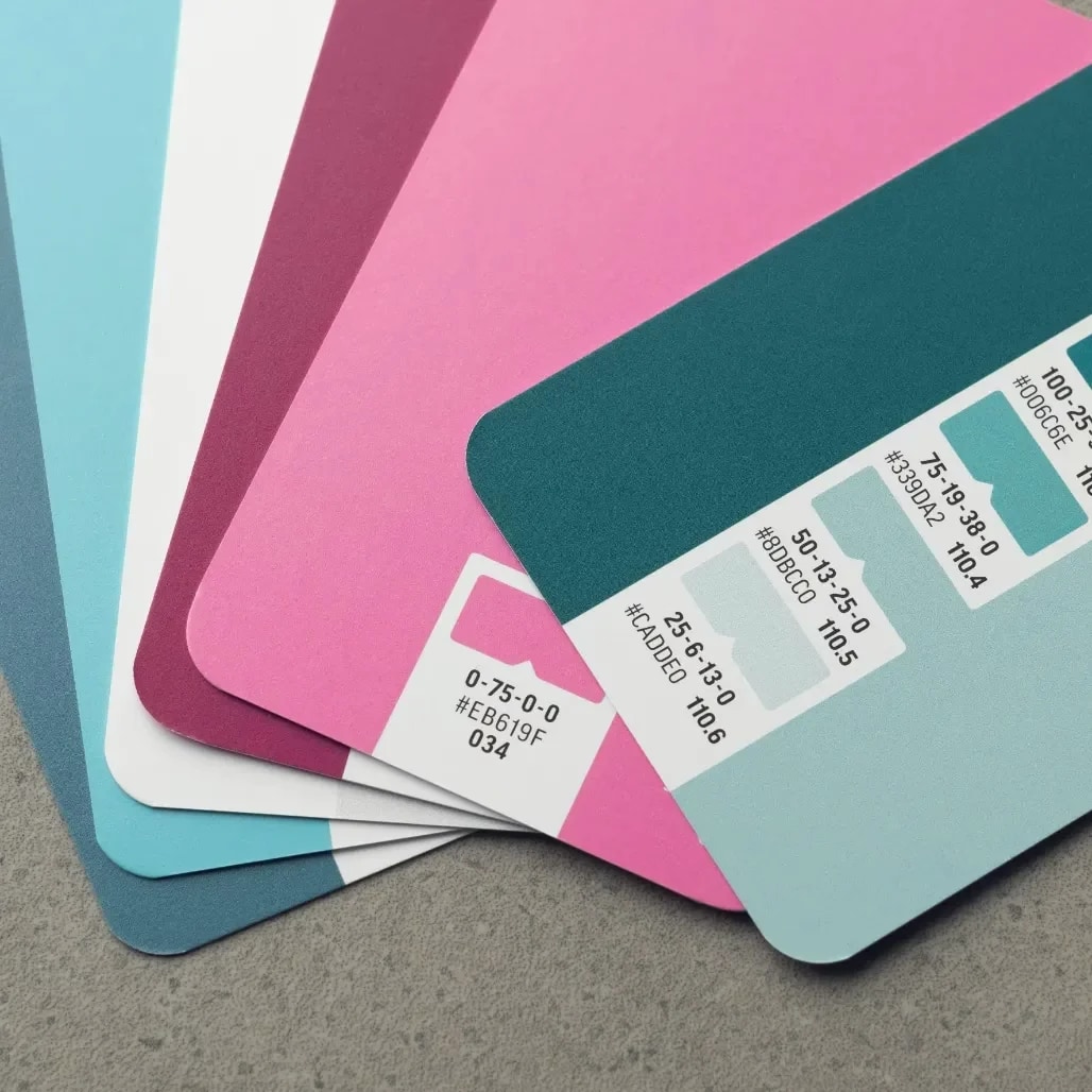
Colours are often associated with emotions. Everyone knows that red is the colour of love, but there is more psychology behind colours than that. It is worth understanding colour psychology before you start on web design, and we are happy to explain why.What associations does each colour carry?
Colours subconsciously evoke associations, which can have different effects on the visitors of your website. It is important to know which colours have which effect. Below we discuss the seven most common colours and the emotions and associations they can evoke.Red
Red stands for love, warmth and strength, and makes our heart beat faster. It evokes urgency and stands out quickly, which encourages us to take action. At the same time, red is associated with danger and pain. Combined with light or warm colours, red can evoke a warm feeling, while with dark colours it can create a dark and ominous mood.Blue
Blue works on the mind, and different shades carry different associations. In general, blue stands for reliability, depth and effectiveness. Light blue gives a fresh, cheerful and calm feeling, while dark blue is associated with loyalty, wisdom, truth and faith. Blue can also evoke negative emotions such as coldness and sadness.Orange
Orange stimulates mental activity and is associated with energy, cheerfulness, warmth and friendship. It is popular with young people and is seen as a safe colour choice. Too much orange, however, can cause discomfort and restlessness.Black
Black is associated with luxury, elegance, status and wealth. It also stands for wisdom and efficiency. Negative associations with black are fear, sadness, anger and danger.White
White stands for calm, clarity and purity. It gives a hygienic impression, but can also come across as empty, sterile and soulless when used incorrectly.Yellow
Yellow quickly grabs attention and is associated with optimism, confidence and creativity. It can be uplifting, but too much yellow can also be associated with illness, weakness and imbalance.Green
Green stands for balance and refreshment, and radiates natural calm. It is a colour the eyes process easily and is rarely experienced as tiring. Negative associations with green are dullness, safety and demotivation. Like yellow, green can be associated with illness and weakness when combined with people.Colour combinations in web design
A good web design usually uses one or two primary colours, complemented by one or two secondary colours for backgrounds, text and lines. It is advisable to characterise your brand in order to determine the right colour combination. This is an important part of your branding. By going through this process carefully, you can align your web design perfectly with your brand identity and target audience.Choosing the right colours for your web design is not as straightforward as it seems. That is why we at Mediabirds are keen to put our knowledge and expertise in colour psychology to work for you. Curious how to get it exactly right? Get in touch and we will be happy to help you with tailored advice.