
Responsive design makes the difference
Mobile traffic has been dominant for years and keeps growing. Yet there are still a surprising number of websites that do not perform well on smaller screens.

Digital Designer
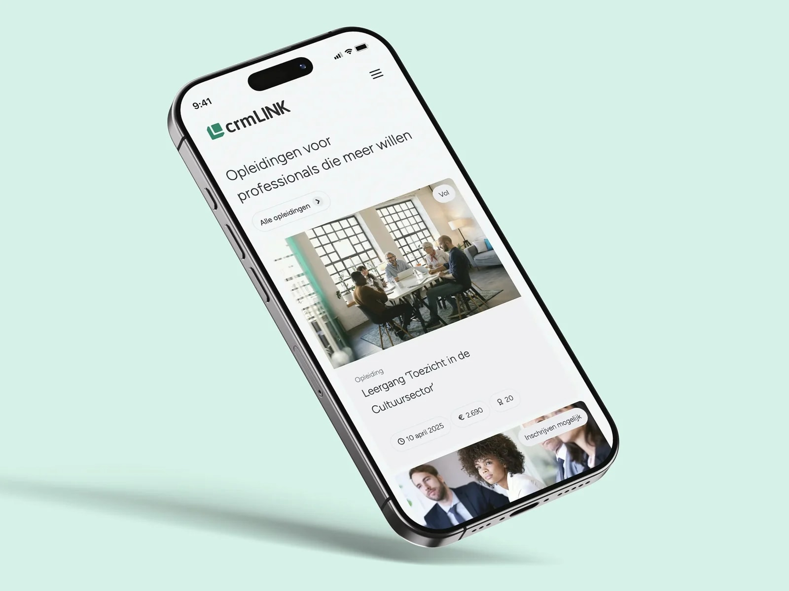
Mobile traffic has been dominant for years and keeps growing. Yet there are still a surprising number of websites that do not perform well on smaller screens. Responsive design offers a structural solution: it makes a single design scalable and flexible, so the content stays clear and accessible on every device.
This involves a coherent approach to user experience, performance and conversion-focused design. Visual design is one part of that. Anyone investing in responsive design today is laying the technical and strategic foundation for sustainable digital growth.
What responsive design is and how it works
Let's start with the basics: responsive design is a design approach in which a website automatically adapts to the user's screen size.This means that font size, layout, images and buttons scale fluidly, so the interface works just as well on a smartphone as on a laptop or large monitor.
Technically, it revolves around flexible grid structures, proportion-based elements and the use of CSS media queries.
But the essence is simple: responsive design puts the user first. A well-designed site feels logical and intuitive, regardless of the device someone uses to visit your website.
The benefits of a responsive website for your brand
A responsive website pays off on several fronts.First of all, it improves usability, because visitors do not have to zoom or scroll sideways to view content.
That lowers the threshold for taking action, which contributes directly to conversion. In addition, Google values websites that are mobile-friendly, which results in better positions in the search results.
Responsive design also has advantages when it comes to management: you do not have to maintain a separate mobile version. Everything runs in one central environment, which is more efficient and more consistent.
In one go, you invest in ease of use, visibility and growth that keeps going.
Common responsive design mistakes and how to avoid them
Designing a responsive website is not simply a matter of choosing a theme and hoping everything fits.In practice, we often see sloppiness that comes at the expense of the user experience.
Think of buttons that are too small, text that is hard to read, badly scaled images or content that appears in an illogical order on mobile.
Interactive elements are also often overlooked when they need to be optimised for touchscreens.
The solution lies in thorough testing on different devices and screen sizes.
Start by thinking mobile first and work from there towards larger screens.
That way you avoid frustrating users and missing out on conversions.
The role of design and UX in a responsive strategy
Responsive design is only truly effective when it goes hand in hand with a strong user experience.This means that both the technology and the visual choices have to be right.
Elements such as white space, typography, buttons and colours must adapt fluidly without compromising readability or brand identity.
Good UX within a responsive setup ensures that visitors find their way intuitively and encounter no obstacles, whatever the device.
By thinking about hierarchy, interaction and context from the start, you lay the foundation for a digital experience that feels logical and is geared towards conversion.