
Design7 May 20266 min
Web design that delivers on your online ambitions
You have a great business, an excellent product or a service you fully stand behind. But how do you translate that to the online world?
12 articles
An interface is only good when someone takes the right step without thinking. Our designers write about UX, UI, wireframes and the differences between them, with examples from the work itself.
You have a great business, an excellent product or a service you fully stand behind. But how do you translate that to the online world?
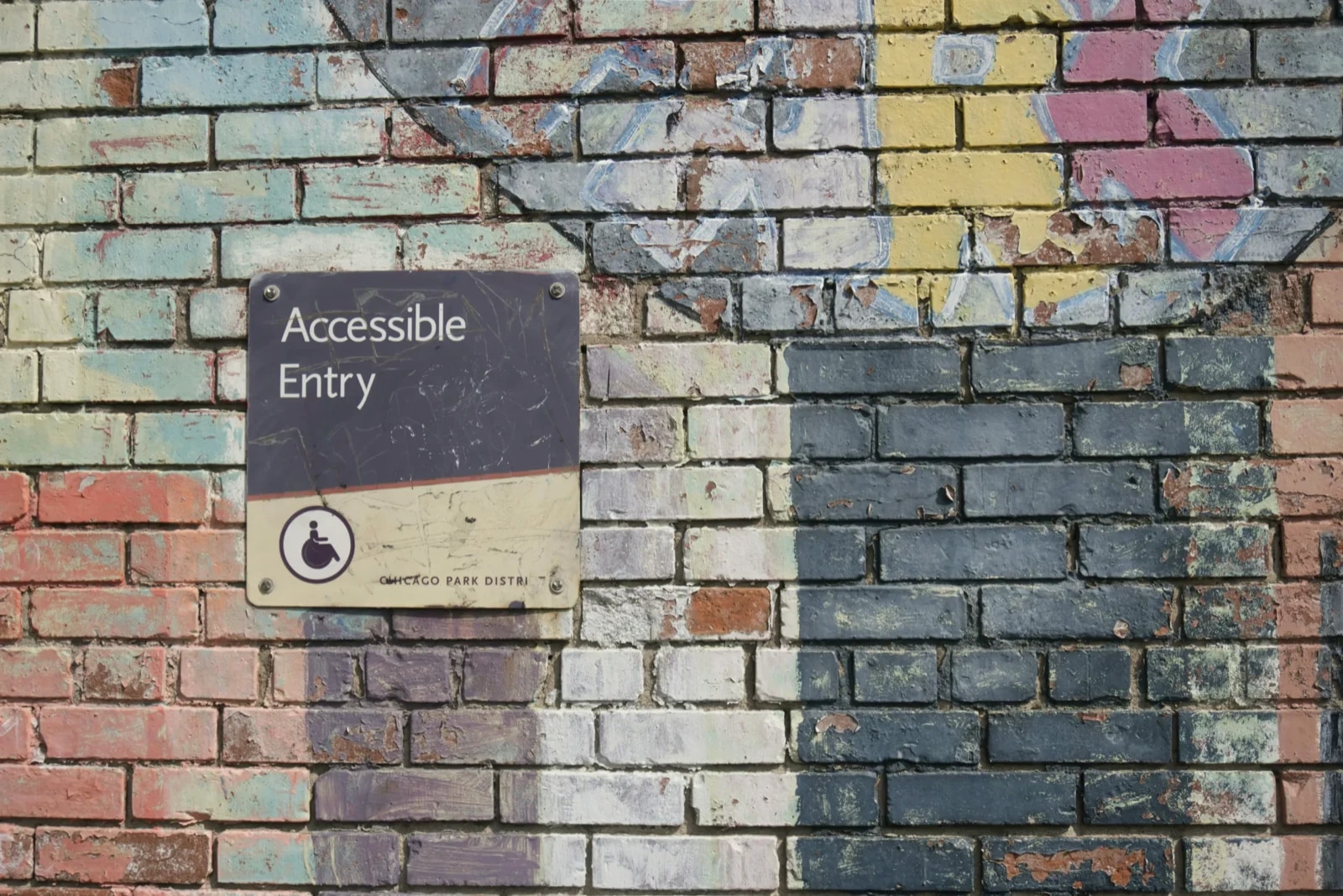
That is the reality when your website has not been designed with accessible web design in mind.
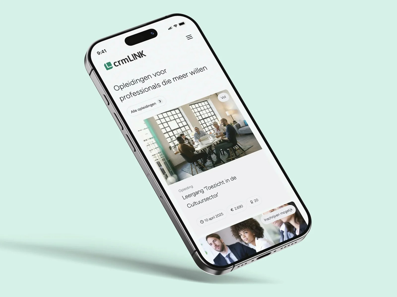
Mobile traffic has been dominant for years and keeps growing. Yet there are still a surprising number of websites that do not perform well on smaller screens.
88% of users do not return to a website after a bad experience.
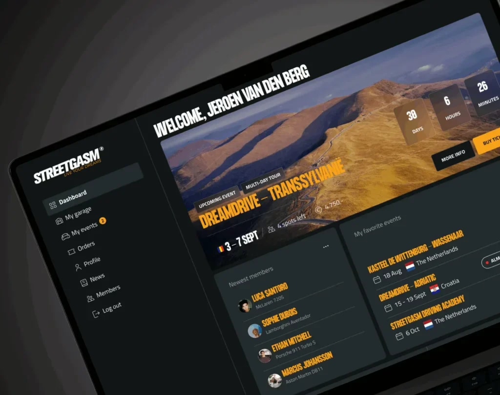
UI design (user interface design) determines the look and feel of the apps and websites people work with.
If you delve into web design, you will often come across the terms UX (User Experience) and UI (User Interface).
Usability is a key theme in web design. But what makes a website truly user-friendly?
Liever meteen sparren?
You can read later. Half an hour usually gets you further.

Niels Teunissen
Founder
No pitch. We look at where you stand and say honestly what we would do. Even if that is that you do not need us.
What exactly does a WebP image in WordPress involve? WebP is the image format created by Google to optimise images better than the popular image formats.
Human evolution is so slow that if smartphones had existed back then, a Neanderthal would have been able to press a button with the same precision as we do.
During the UX process, the user experience is defined, analysed, designed, implemented, evaluated and optimised.
Web agency Mediabirds sees more and more clients who want to make their website mobile-friendly. Standard responsiveness on mobile screens is often something that needs more attention.
The question 'do you like this' is the wrong question. A design is good when someone who sees the site for the first time knows within a few seconds where they are, what you do and what the next step is. That can be tested: have five people carry out a task and count how often they hesitate. Taste comes afterwards, and that is negotiable.
That is why we start with wireframes, without colour and without imagery. As long as there is no visual identity on it, the conversation is about what is on the page and in what order. As soon as there is colour on it, the conversation is about colour. It saves rounds, because most discussions about a design are really about the content.
Accessibility belongs in that same phase. Sufficient contrast, a readable font size, a form that can be operated with the keyboard and a clear focus style are design decisions. For many services it is now also a legal requirement, because the European accessibility directive has applied since 28 June 2025. The practical argument is simpler: whoever cannot operate it does not become a customer.
This category holds the articles in which our designers set that out: what colours do psychologically, where UX stops and UI begins, and why most 'beautiful' websites lose out to the boring ones that do it well.
The questions we get asked most about this. Yours not among them? Ask our assistant or just give us a call.
UX is about the route: which steps someone takes, in what order, and whether they understand along the way what is expected of them. UI is about what they see on that route: typography, colour, buttons, spacing. A beautiful UI over a poor UX is a neat facade for a house with the stairs in the wrong place. The other way round does work, but it feels cheap.
Because a design without colour keeps the attention on the content. In that phase you decide what is on a page, in what order and what the most important action is. Those are the decisions that are most expensive to reverse later. As soon as the visual identity is on it, every comment is about the visual identity.
For government bodies, it has for years. Since 28 June 2025 the European accessibility directive (the European Accessibility Act) also applies to a range of commercial services, including web shops, banking, transport and e-books. Whether your organisation falls under it depends on your service and your size; small enterprises are partly exempt. The practical standard to work to is WCAG 2.1 level AA.
We count on two rounds per template: one on the structure, one on the finish. That only works if the feedback comes from one voice. Most projects that overrun do so on collecting opinions. So agree in advance who decides.
Yes, for every project larger than a handful of pages. A design system is nothing more than agreements that are fixed: colours, spacing, headings, buttons and their behaviour. It costs time at the start and pays it back as soon as a page is added: then you assemble instead of designing again.
Questions about design?
Reading is one thing. Knowing what it means for you is another.
Tell us what you are running into. In half an hour you hear what we would do, and why we think so.
Free check·30 sec
How visible is your website?
Over twenty checks on SEO, technology and whether an AI model can quote you.